AZURQAT
Art Direction • Illustration • Visual Storytelling
Crafting a visual identity that translates sound into atmosphere through storytelling, symbolism, and design.
Azurqat explores the relationship between music and visual storytelling through a cohesive identity system built around symbolism, character design, and recurring motifs. Drawing inspiration from each artist's favorite color, I developed a visual language that translated individual personalities into distinct characters and narrative elements carried across album artwork and supporting visuals.
Overview
art Direction
Developed the visual concept and established a cohesive artistic direction across releases.
illustration
Created album artwork that translated each song into a unique visual narrative.
Content Design
Built a recurring cast of symbolic characters that connected individual releases into a larger visual world.
DESIGN PRINCIPLES
Personal Symbolism
The duo's favorite colors, blue and green, became defining visual elements that reinforced each artist's identity.
Recurring Characters
Their cats evolved into new forms across each release, creating recognizable characters that tied the artwork together.
Every Song, Same Universe
Each cover was inspired by listening to the music first, allowing the imagery to reflect the atmosphere of the track while remaining part of a consistent visual language.
cats out of the bag
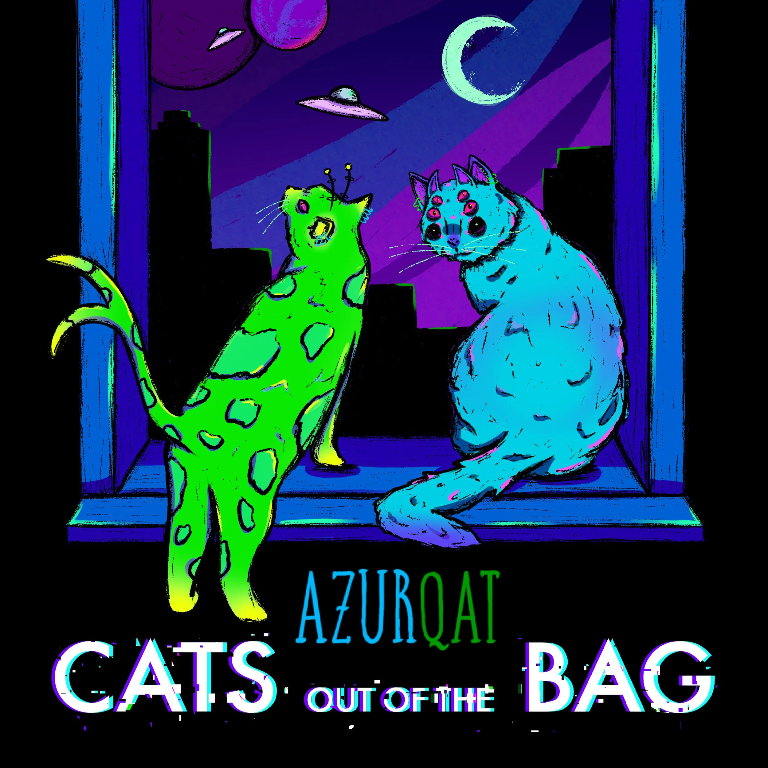
Cats Out of the Bag was the first piece in the visual world created for Azurqat. I began with an intuitive sketch based on the energy of the music, which became the foundation for the duo’s own visual direction. From there, I translated their concepts into a surreal, neon universe that established the recurring themes of the series: psychedelic environments, cosmic imagery, and a sense of exploration beyond the familiar.
lesson one
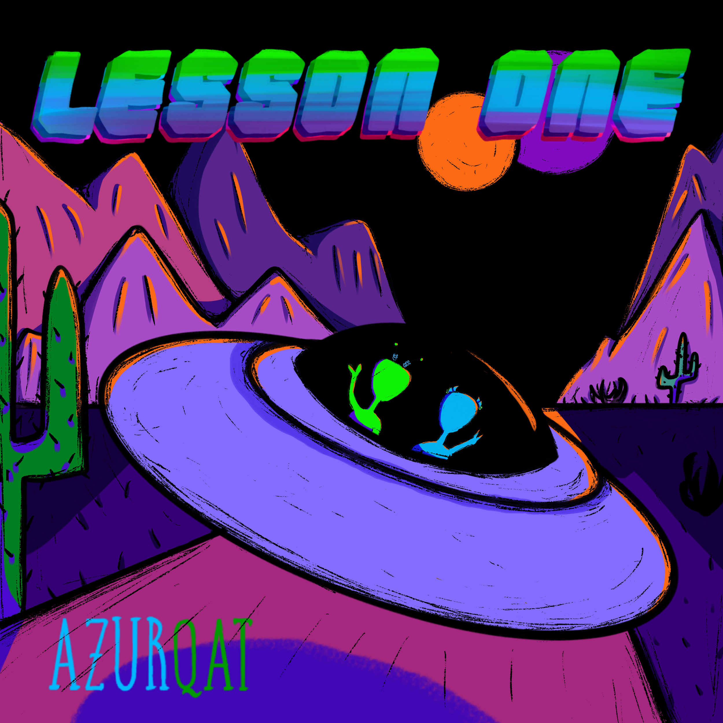
For Lesson One, I approached the artwork by translating the feeling of the song into a visual experience rather than illustrating a literal narrative. The neon palette, cosmic setting, and surreal characters emerged from my interpretation of the music’s atmosphere. The blue and green aliens represent transformation, where the characters enter a new world or realm and begin a larger journey within the Azurqat universe.
tundra
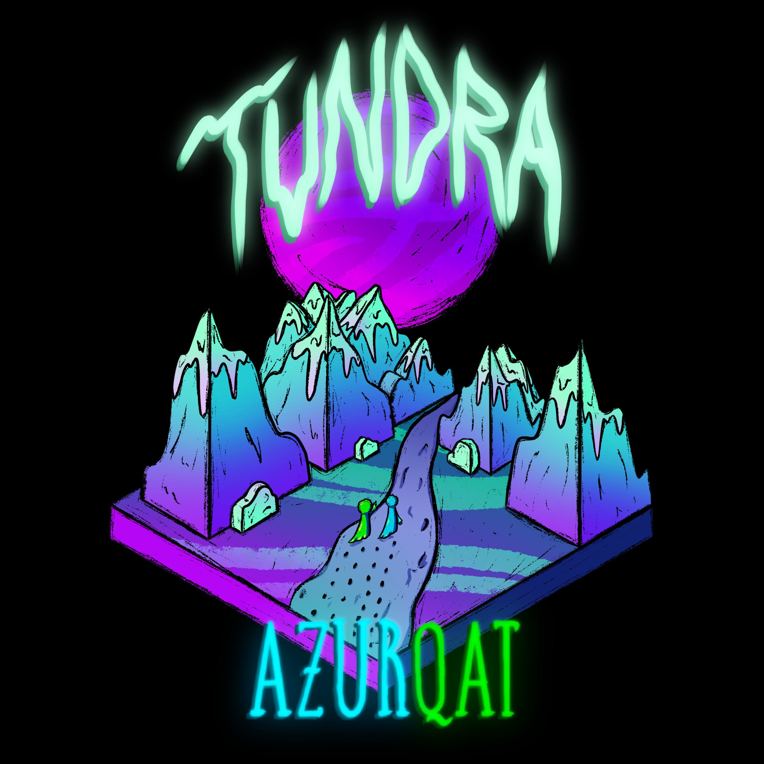
Tundra provided an opportunity to explore a more literal interpretation of the music’s themes. Inspired by the title, I created a frozen landscape while maintaining the surreal visual language established throughout the series. I incorporated custom hand-drawn typography to make the title feel like part of the environment, blending the text and illustration into one cohesive world.
the void screams back
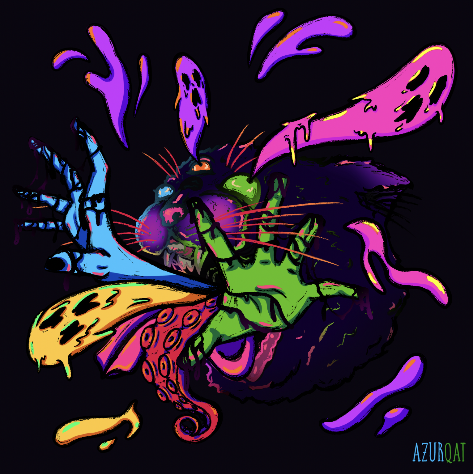
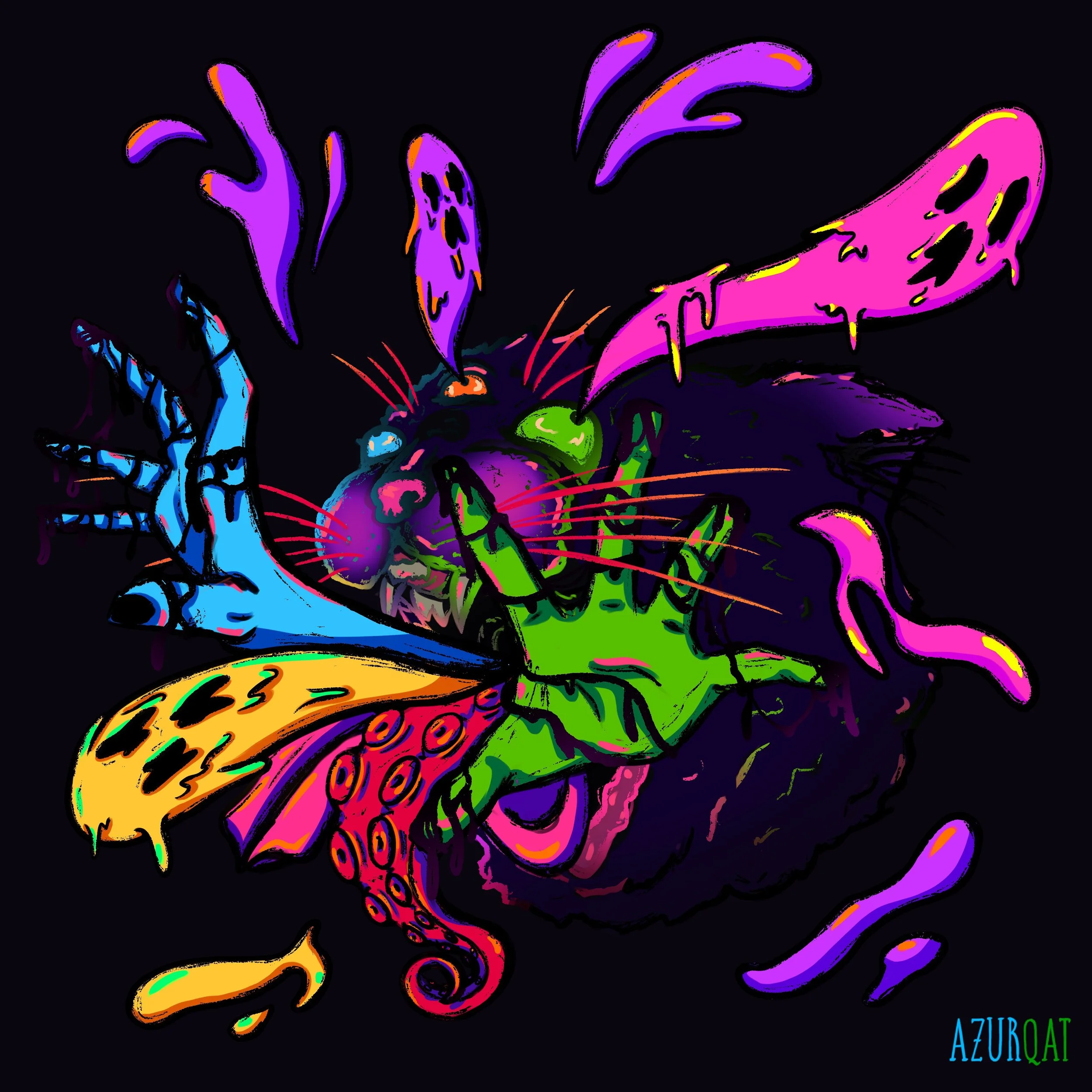
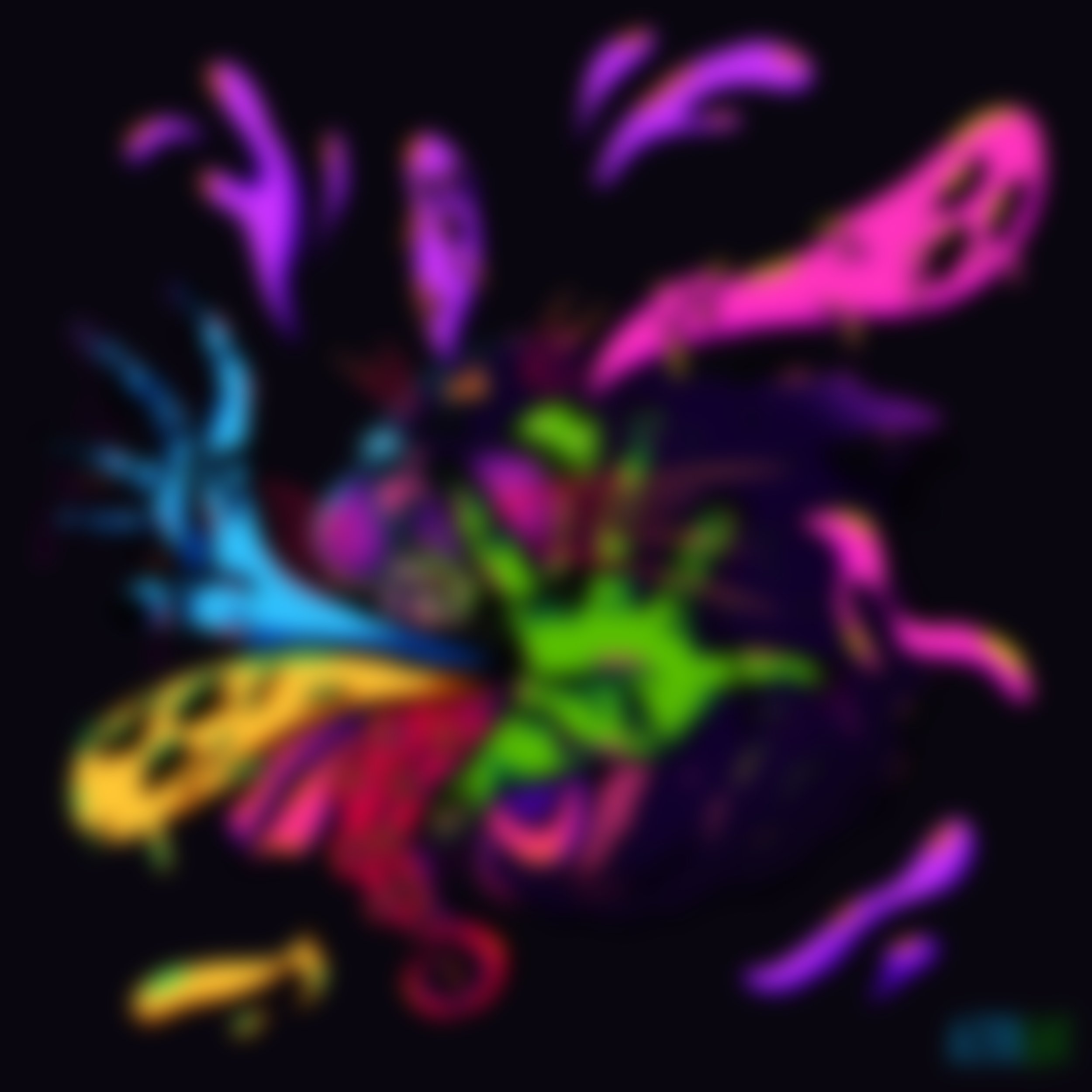
The Void Screams Back became a culmination of the visual language developed throughout the series. After exploring different concepts, I returned to the cat imagery from the first cover as a way to reconnect with the beginning of the project. The addition of the blue and green hands, ghosts, and tentacle-like forms created a surreal collision of familiar and unfamiliar elements—representing the chaotic, mysterious energy of the song while bringing the full visual universe together.